Improving the Usability of Fhp’s Website
by designing a Navigation Concept
Bachelor Thesis Wiebke Klöpping
Abstract
The Fhp website provides access to different kinds of information. Whether users want to learn more about the organisation, look for some info-services, need the course catalogue, or access to a specific department, they depend on the site navigation. Ideally, its interface design should help them to find what they are looking for.
However, the analysis of Fhp website has shown, that the navigation works »well enough«, allowing students to access what they need to – but after some struggle.
For that reason, this project outlines some of these navigation problems, makes suggestions to improve user experience and information architecture.

Introduction
Problem Description
Frequently, the webpage of the Fachhochschule Potsdam (Fhp) causes trouble for its audience. As an example, people always get very frustrated to use the main navigation, by the reason it is interacting as a hover menu with users. Every time, when the user is opening the menu, he could not intuitively move the mouse directly to a submenu item, because this will accidentally close the menu. That menu behaviour makes looking for information hard and annoying for everyone.
Click to continue reading
Another significant pain for users is that objects are not locatable. The sites offer categories which are not always comprehensible for students and people with no academic experience because its structure does not match with their mental models. Additionally, users cannot discover some relevant content, because it deeply rooted in the hierarchy of the website or hidden in unfamiliar menu sections. Moreover, when users look for content through the search function, they often can not find the according page because it does not work effectively. These usability issues waste time and energy of people. Navigation on Fhp’s website can no longer be an annoying experience and requires optimisation.
Research Question
»How can we improve the usability of the Fhp website by adjusting the navigation elements and the information architecture (IA) to the end that we optimise the user experience (UX)?«
user-centered design process
Analysis User Groups
Vivamus magna justo, lacinia eget consectetur sed, convallis at tellus. Donec rutrum congue leo eget malesuada. Vestibulum ac diam sit amet quam vehicula elementum sed sit amet dui. Curabitur non nulla sit amet nisl tempus
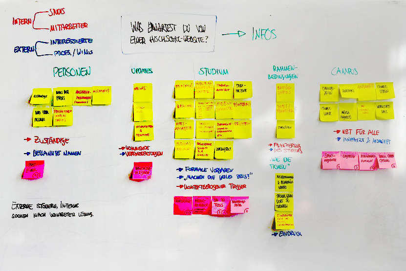
Cluster of different User Groups – Photo by Malte Völkner
focus Group students
Persona Development
This persona works as an example user for the whole project. Its character is shaped by realistic intentions and needs of a student of the Fhp website.
Persona Julia
Click here to read the persona description (PDF)
| Persona | Interface Design student of Fachhochschule Potsdam |
| Fictional name | Julia Schulz |
| Job title/ responsibilities |
|
| Demographics |
|

Persona Julia Design Student – Photo by You X Ventures on Unsplash
evaluation of user experience
Use Case Development
Below are the uses cases of the evaluation. For each use case, we wrote down the several steps the actor is going to do on the website of FH Potsdam. To identify problems and give them a structure, the UX models of Peter Morville and Whitney Quesenberry has been used.
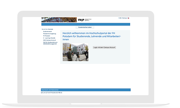
download the certificate of study
Click here to read the use case description (PDF)
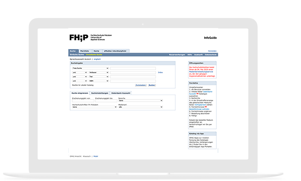
Go to the Library Catalog
Click here to read the use case description (PDF)

Read the course catalogue with mobile phone
Click here to read the use case description (PDF)
Analysis of User Navigation
Visualisation User Navigation with Heat map
We used tracking data of the last year and a heat map to identify the most relevant subpages of the webseite. The heat map helped us to visualize these pages and has been the basic of the new navigation design.
heat map of user navigation
Click here to see the head map (PDF)

Analyse similar Websites
Competitor Analysis
We analyzed other websites form similar institutions. The reason for this competition analysis was to find clear patterns of navigation and web design.
We had asked the following questions:
- How present similar institutions their content?
- What has been displayed on their start page?
- What is their focus content?
Overall, it has to be noted that there are no clear pattern and standards for presenting complex content of university’s websites. Every institution has different priorities to locate their content.
restructure the information architecture
Card Sorting
At first, I documented all pages of the main navigation and of the design department on cards.
After that, I organized a workshop with colleges to figure out a new information architecture. We worked with the UX technique card sorting to reduce the chaos of the website’s information structure.
For that reason prioritized the most relevant pages and adapt the structure. The results of our jointly developed information structure has been the basic for the new navigation design.

Statements of students and study applicants
User Interviews
To understand the user needs as well as the websites’ usability I carried out interviews. For that reason, I asked students from other departments and study applicants about their difficulties and user experience of the website.
This study delivered important results, which I took into account by redesigning the website. Also, the results had been basic for developing new information architecture and relevant navigation elements.
“Es ist super nervig, das Vorlesungsverzeichnis mit dem Smartphone zu lesen.”
– Student Soziale Arbeit
“Ich habe aus Verzweiflung eine E-Mail geschrieben, weil ich die Infos nicht gefunden habe.”
– Bewerberin Interface Design
“Ich muss jedes mal googeln, um den Online-Katalog der Bibliothek zu finden.“
– Studentin Architektur und Städtebau
“Von der Platform MyCampus hätte ich gerne vor dem letzten Semester erfahren.”
– Alumni Bauingenieurwesen
User-Centred Design
UX & UI Design Process
After the user research and website analysis, the design phase of the user-centred design process has started.
The research and analysis results outline that the webpage has many usability issues which adversely affect the user experience. These problems are based on the user navigation design, the AI structure and that the web design is not responsive.
Click to continue reading
For improving the user satisfaction, this project has developed a new interface for the main menu, submenus and other navigation elements – like the search bar and footer, an alternative landing page navigation besides the current navigation system, as well as adaption of the website’s information architecture. Moreover, all design decision base on the previously developed persona Julia who represents Fhp’s stakeholder group students.

Developing a Visual Concept
From Wireframe to Visual Design
First at all, I developed wireframes to connect the website’s information architecture to its visual design. The next step was to design new navigation elements, like head bar, main menu, footer and other features, as well as, the development of a mobile prototype with a responsive layout and navigation concept for small screens.
The wireframe specified the website’s layout with the new navigation elements and their functionalities. It helped to develop quickly a responsive version for mobile use.

Paper & Pencil
I developed with paper and pencil low-fidelity wireframes.

Sketch
I designed with sketch mockups of the user interface design.
InVision
I build with InVision a prototype for desktop and mobile use.
Silder
Graphic 1 – Wireframe of websit’s Landingpage
Graphic 2 – Mockup of websit’s user interface design
Main Navigation Re-Design
Problems of the Hover Menu
One of the worse things about the current Fhp menu is that it forces the user to move their mouse through hover tunnels to click an item. The hover menu does users more annoying than good because it makes navigation harder and slower.
When the hover menu opens, users cannot move their mouse to the item they want in a straight line. If they do, their mouse will fall off the hover path and close the menu.
Another problem is that items closest to the menu edge are more difficult to click. Users have to slow down their mouse movement otherwise they miss the item and land outside the menu, resulting in a menu close.
Current main menu with poor user interaction and experience
Changes of Menu Design
The new menu has a more user-friendly design that opens on click instead of on hover. It only opens when the user has clearly decided to open it and not by default.
Another benefit for the usability is that the menu bar is located on the top of the website’s header. The head is a familiar location for main menus. This location increases the visibility of the menu and the user doesn’t have to scroll down the page.
Moreover, the menu design follows the pattern of the letter F. This pattern increases the readability that the user can briefly scan the main elements of navigation.
Finally, the new menus design looks more interactive by adding arrow icons and colour highlights. These visual hints help the users to realize what items are clickable and which menu category is active.
All design changes make the navigation quicker on the website for the users.
New main menu with new location, reduced elements and good usability
Sub Navigation Re-Design
Problems of the Sub Menu
The current submenu design has problems regarding its usability, too. The menu design forces the user also to move their mouse through hover tunnels to click an item.
In addition, the sub-items are very complicated to read because they are aligned horizontally in a row under the row of the main categories. That alignment displays more block element than separate items.
Further, the menu has many categories with deep sub hierarchies which makes navigation for the user more difficult, too. Thus the user experience of the submenu is very poor.
Current sub menu with poor user interaction and expericne
Changes of Menu Design
To keep the navigation system consistency, I established the same interaction behaviour for the submenu, as the already discussed main navigation.
After clicking on a sub-item of one main category, users currently land on the first article of this subcategory. For that instance, I implemented category landing pages that merely offer links to subpages.
Besides, the submenu items are displayed always on the left side to give users orientation and overview of the subcategory.
Beyond that, I reduced the categories from nine to five main items. This minimalist presentation helps users quickly understand what’s available to select the right section.
New main menu with new location, reduced elements and good usability
Head Bar Re-Design
Problems of Head Bar
The current head bar contains elements (like Datenschutzhinweis, Impressum or Presse ) that are less useful for navigation on side.
During my analysis, people missed the benefits of a sitemap (or index page) very much, because it tells a user precisely what pages and information can be found on the website, and provide quick access to those pages.
Moreover search is central for complex websites with information for different user groups. The search function need a better design to provide more effective results for the users. Fellow students have told me when they use the search function a lot for navigation on side. But it provides such poor results that they prefer Google to find the information they are looking for.
Changes of Head Bar
The new header design contains new elements and a more effective search function to improve the website’s usability.
It is very convenient for users to have an overview page. Whether it is a page with lists divided into categories (sitemap) or lists sorted alphabetically (index). These lists are small elements that often go unnoticed developing a website, but are occasionally useful to someone.
The new search box design includes a more significant glass icon to make it easier noticeable. I added a search button because it helps people recognise that there’s an additional step to trigger the search action. The input field has been enlarged too. Finally, the idea of filters and examples for frequently used queries makes searching more efficient and effective for users.
Current head bar with less useful elements and poor search function
Head bar with more useful elements and new search box design
Footer Re-Design
Problems of the Footer
The Footer has similar problems like the current main menu and head bar.
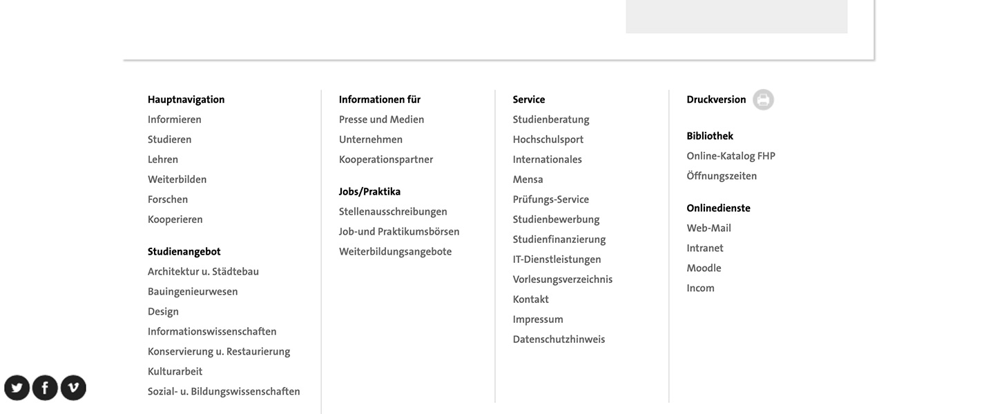
The current Footer provides lists with about 24 links. In my perspective, it has too many elements. Some of them are redundant like the link to print the website or links that are in the header bar or man navigation, too.
The main problem is that the user doesn’t get what kind of information the footer provides for him. Even if there are some helpful elements the user will probably don’t recognize them.
The user doesn“t get what kind of information the footer provides
Changes of the Footer Design
Usually, when people are looking for contact and address information of an institution, they often scroll to the footer. Putting pieces of information there is a convenient service for Fhp’s user groups.
Additionally, route directions, city map and links to public transportation make it even more accessible to navigate to the campus. Fellow students wish to get more rapid access to the AStA and Design StRa site during my studies. Therefore, I placed the logos as a feature item in the new footer.
Another useful new element in footers is the »back to top« button. With this button, the user saves time to navigate on the side. It is one of those small details that could enhance the usability a lot.
Footer with new layout, elements and information the user expect
Responsive Design
Problems Poor Mobile Usability
One crucial problem regards the usability of mobile devices because the website is not responsive and optimized for touch screens.
For every participant of my study navigation and reading information with a smartphone had been very frustrating. All in all, the interaction is worse and pieces of information are not readable with small displays. This issue has a significant impact on the users’ satisfaction of the website.
No responsive design causes a poor usability with mobilie devices
Change the Responsive Design
The new mobile website structure is lean and concise to its desktop version. The layout of the site’s contents is adapted for smaller screens to keep them readable and touchable. A consistent user interaction pattern and graphical interface makes the mobile navigation intuitive and provide a good user experience.
There are just five sections in the head bar menu. The first section is the button to the main navigation. If it is open a vertical list of main categories will be displayed. The user can choose one main category and will be navigated to a deeper hierarchy level. If the user navigates to a subpage a submenu is displayed with similar navigation structure and user interaction.
Regardless on which page and hierarchy level the user the head bar menu is always displayed. Therefore the user can always use the search function, look for the contact information, switch the language or use the stakeholder navigation of the website. Beyond the main navigation, these four functions are available through the mobile head bar menu. Moreover the menu items „quick links“ and „index page“ are a part of the stakeholder menu section.
Responsive design provides a good user experience by navigation on side
Mobile Prototype
Click here to interact with mobile protoype (InVision)
the navigation dilemma
Challenge
One principle of navigation design is to avoid deep website’s hierarchy. Ideally, the fewer menu levels people need to click through, the quicker and least confusing it should be for them to access what they want.
However, the Fhp website’s information architecture is complex and its hierarchy has until five numbers of levels, what makes content less accessible for users. The problem is that you can’t change structure of the website at all.
Navigation Dilemma
Click here to get more details about navigation dilemma (PDF)
Solution
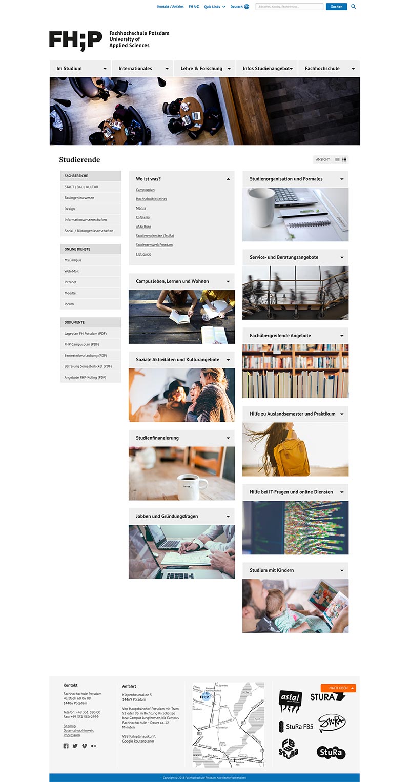
My idea is to offer users an alternative navigation structure beside the main menu navigation. This navigation system based on several landing pages with a flat hierarchy, which guide the users to their objectives onsite. These particular pages are designed from the perspective of a specific target group, like students, and based on the principle of reduced options for navigation.
Therefore it displays only menu items, which are relevant for the target group the user belongs to. For example, students are less interested in standards for research proposals, than information about Bafög requests.
Landingpage Navigation
About the Idea of LP Navigation
The landing page navigation has seven major categories, which represents seven different target groups (stakeholders) of Fhp institution, but only two vertical levels underneath. The major categories of user groups are Studieninteressierte, Studierende, International Students, Alumni, Mitarbeiter, Unternehmen, Presse. The next levels are pools of specific topics of interests. These pools contain links for objectives – like questions, contact persons, services or other requests that the focus group is usually interested in. For example, students need quick access to the course or library catalogue, frequently have questions about examination times or are interested in news and events of their campus life.
User’s Benefits of LP Navigation
The new menu has a more user-friendly design that opens on click instead of on hover. It only opens when the user has clearly decided to open it and not by default.
The navigation by particular landing pages with a flat hierarchy will improve the usability of Fhp homepage. One significant user benefit is that its content will be more discoverable for users when it is not buried under multiple intervening layers. I have made the experience that some offerings and activities are so deeply rooted in the hierarchy of the website, that people will never make use of them.
If categories are ambiguous, locating items into multiple pools improves their findability. I think this option can provide much frustration for the users if researches have shown they associate different categories for one item.
Also, the landing pages only display topics that are relevant to their perspective of the user group. Therefore reduced content and navigation options will make the user experience more effective and efficient.
The subcategories (landing page pools) can be more specific and do not overlap what makes them easier to understand. Using more descriptive and colloquial terms can improve the intelligibility because labels will be less abstract for the users.
Due to that, they cover a more extensive range of particular objectives and requests, what makes the page also more usable. For providing that the users do not get overwhelmed with too many categories, the side has enough space for a graphic that illustrates the pools’ topics.
Mockup of landing page for user group students
Desktop Prototype
Click here to interact with desktop protoype (InVision)
Project Conclusion
Review and Reflexion
The landing page navigation based on the theory that each user will know what user group he belongs to and will only need the features targeted at this segment. So, it is suggestive to think organising Fhps web pages’ content by user groups would be easier for the users. The function of the landing page is to help users navigate more efficiently and effectively by anticipating each group’s needs and sending them down to their particular site. Despite the described advantages, role-based navigation systems can cause usability issues too. One problem can be, that forcing people to self-identify creates an additional step and takes people out of their task mindset. This question increases users’ cognitive effort, and people have not even made it past the navigation yet. Additionally, users can ask whether the category will have information about that group or for that group.
Project Conclusion
Click here to read full conclusion of the project (PDF)
For example, the link Studierende might lead to an expectation to see information about the students who study at the university, rather than to think specific information for student members, because the label alone can’t tell what to expect.
Besides that, they can feel anxious that the information they see might be incomplete or incorrect. Therefore, usability tests are necessary to learn more about the user’s experience (way of thinking, needs and feelings) by asking them what they expect from user group categories.
However, even if the landing page navigation based on the best user researches, the page is always developed for the average user and can not fulfil the individual needs of everyone. This matter regards the whole User experience form the Fhp’s homage, form IA structure up to the visual navigation design. The website will never be perfect. There is ever potential for improving its usability. All in all, periodically user test are essential to know what needs to be optimised and the first step to enhance the whole user experience.
Selected Work
Driving User-Centered Design in Automotive Software
2023-2024 | Product Design
AI-based Dustomer Dialogues
2022-2021 | Interaction Design
Redefining Group Management
2020-2022 | UX/UI Design
Strategische Neugestaltung der BBU-Webseite
2021 | Information Architecture


